Interview--Paul Shipper (Super Mario Bros. Blu-Ray Steelbook Artist)
Conducted by: Steven Applebaum & Ryan Hoss
Posted: September 8, 2017

Zavvi's Limited Edition Steelbook variant of Second Sight's Super Mario Bros. Blu-Ray
When Second Sight's marvelous Blu-Ray of Super Mario Bros. released back in late 2014, for us here at The Archive, it was a huge accomplishment. We now have the film in high definition, and much of the work we've done for this website got included on the disc as special features, and we were able to help produce the wondeful documentary feature as well. From then on--everything else SMB-related is just pure gravy.
And back in February of 2017, we got a boat full of it. Steelbook distributor Zavvi released a unique, Limited Edition Steelbook variant of Super Mario Bros. And not only was it a steelbook--but the company comissioned some gorgeous new artwork specifically for that release. The artist behind this new Steelbook cover is Paul Shipper, who has a keen ability to combine the nostalgic and bold full-illustration poster styles of the 80s with a modern flair. To celebrate this special Blu-Ray re-release, we were able to pick Paul's brain a bit, asking questions about his process and what it took to create this piece.
Super Mario Bros. The Movie Archive: How did you first come to create artwork for the film industry and the home video market? Have any films or artists in particular influenced your own style?
Paul Shipper: My work has been online for over 20 years now in one form or another, so eventually it gets under the noses of the right people. That's really how it started...it's taken almost that long to become an overnight success, I suppose, although I don't think of myself that way--I am just scratching the surface. I have always been heavily influenced by the movie posters and video box art from the time I was growing up and that love is carried with me to this day.
SMBMA: Were you familiar with the Super Mario Bros. film before Zavvi commissioned you for its steelbook artwork? Were you surprised that it was receiving a release?
PS: Of course! I liked the movie when I was younger. Despite its initial lackluster performance in the box office, I know it has an abundance of loving followers and it has a special place in many peoples' hearts. I wasn't too surprised it was getting the steelbook treatment as it has become quite a cult film in many ways and there is an audience for it that remember it with fond memories.
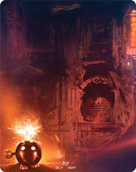
The back cover of the Super Mario Bros. steelbook features one of our favorites--the Bob-Omb!
SMBMA: Super Mario Bros. has become something of a cult icon in the years since its theatrical release. Part of this has to do with its troubled production history and unique artistic direction, but largely its staying power comes from its association to the ever-popular game franchise. Does popular and critical opinion affect how you approach the 'tone' of your film-related poster art?
PS: There are many things that can affect my approach on a project, but I always try my hardest to go with how I feel about it and my personal relationship with a project (if I have one) and exploring the emotional side opposed to just straight images of the main characters. I want the finished art to remind you of why you love something or be able to introduce it to somebody who has never even seen it. I have to say, the documentary about the making of the film [on the Second Sight Blu-Ray] was an amazingly frank and interesting look at everything that went on behind the scenes and I would recommend that to be watched by everyone who loves film and its many processes.
SMBMA: What was your process in developing a new poster interpretation for the film? You had mentioned to us previously that you had earlier revisions that were darker in tone, but you eventually came out with something brighter.
PS: I initially had the idea of taking the dystopian feel further than eventually came out on the cover art...[it was] more of a serious approach ala Blade Runner. But ultimately, we all decided it was right to make it a little brighter and lighter. Finding reference images for the cover art proved to be quite difficult but I managed to make things work, I think. I really wanted to show off some of the neon signs seen in the film and the overall feel of the movie. And one of the key components--the crystal necklace being a centrepiece for the artwork.
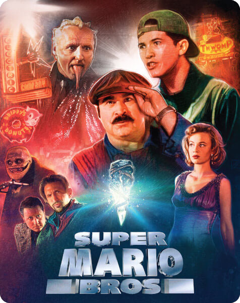
Images don't do Paul's artwork justice. The steelbook artwork shines--literally--in real life!
SMBMA: You just mentioned that your final artwork ended up being much brighter than earlier concepts. Do you think that speaks to the heart of the film itself? Despite its bleak, dystopian setting and visuals, Super Mario Bros. is inherently a comedic production known for its "ham and cheese" delivery. It can be difficult to faithfully capture that irregular tone.
PS: I think you hit the nail on the head there--the film is very much a mix of two worlds and it's quite the romp, which I hope is somewhat conveyed in the cover art. Having a wraparound cover was a nice treat too; I really wanted to show some of the sewer systems and fit in the little Bob-Omb in the back corner. The film on viewing today is most definitely an enjoyable watch and an escape to another world which I think they did a great job at creating.
Thanks again to Paul Shipper for this interview! You can follow him on Twitter @paulshipper, visit his website HERE, and you can find the Zavvi Limited Edition Super Mario Bros. steelbook HERE!